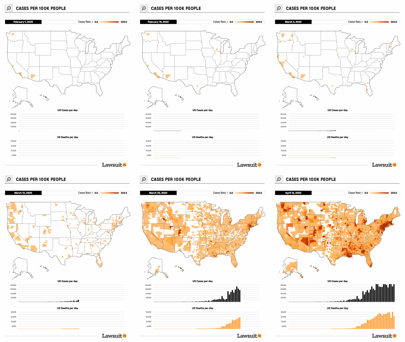
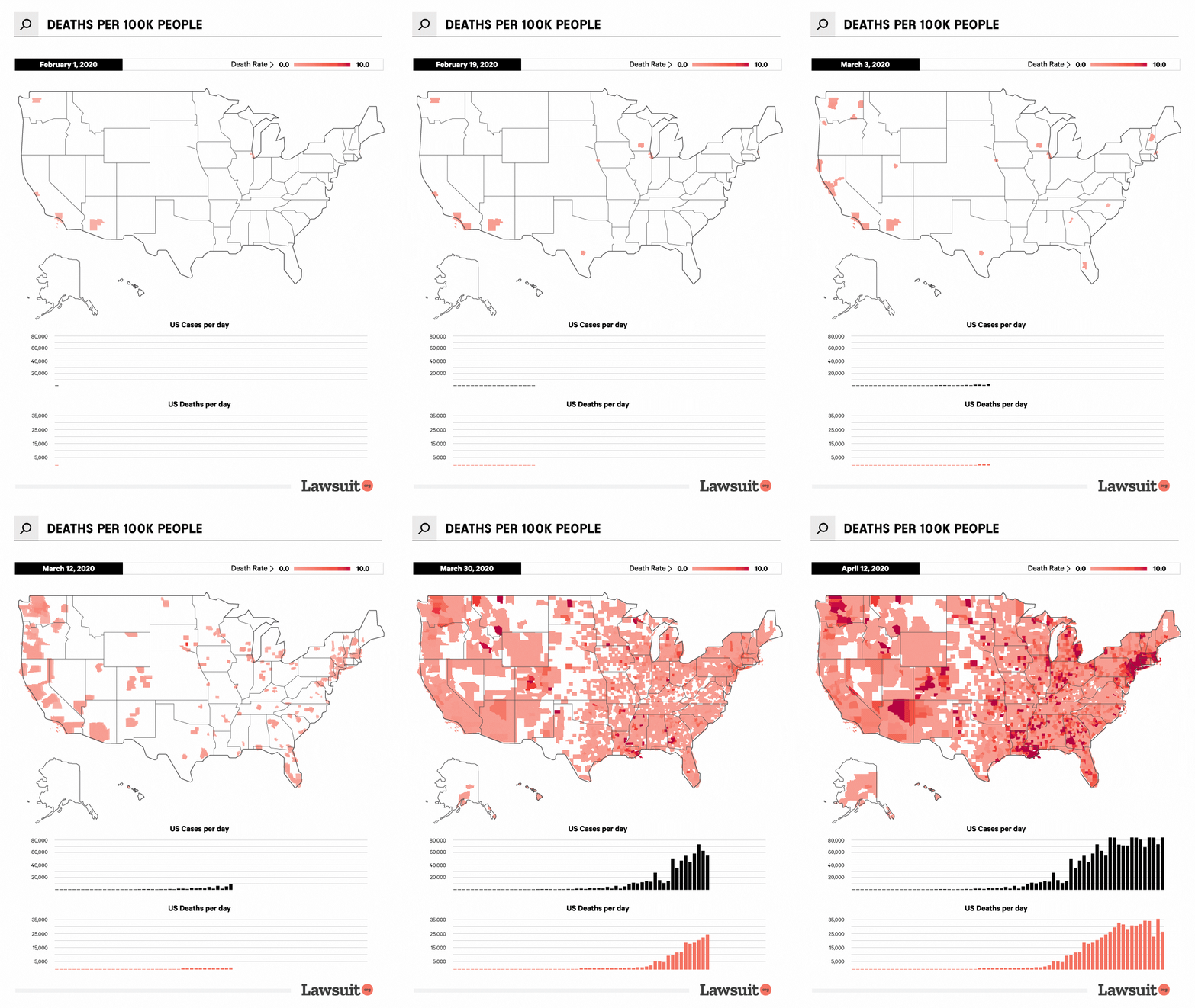
Using New York Times COVID-19 data, we created an animated map to show growth and spread of the Coronavirus pandemic in the United States. We documented the number of deaths and cases over time. We then went to President Donald Trump’s profile and pulled related tweets and public statements. We then put both datasets onto the animated maps below to explore his response as the pandemic progressed through America.
President Trump’s Coronavirus Tweets Compared To Cases

President Trump’s Coronavirus Tweets Compared To Deaths

Sources:
1. https://www.c-span.org/video/?468493-1/president-trump-holds-rally-manchester-hampshire&start=1878
2. https://twitter.com/realDonaldTrump/status/1232058127740174339
3. https://www.whitehouse.gov/briefings-statements/remarks-president-trump-vice-president-pence-members-coronavirus-task-force-press-conference/
4. https://twitter.com/realDonaldTrump/status/1235604572850343937
5. https://twitter.com/realDonaldTrump/status/1237027356314869761
6. https://twitter.com/realdonaldtrump/status/1237024549046288385
7. https://www.whitehouse.gov/briefings-statements/remarks-president-trump-vice-president-pence-members-coronavirus-task-force-press-briefing-4/
8. https://github.com/nytimes/covid-19-data/blob/master/us.csv
Fair Use Statement
We create content to be shared to help educate people. You are welcome to share our findings, but please link back to this page.
